
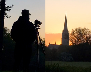
I have a strong attachment to Salisbury. I've worked there often and was working at St. Thomas at the time of the Skripal poisoning.
I've nothing but admiration for the resilience of the people of Salisbury. Salisbury suffered an economic downturn after the poisonings and then had to deal, like the rest of us, with the pandemic.
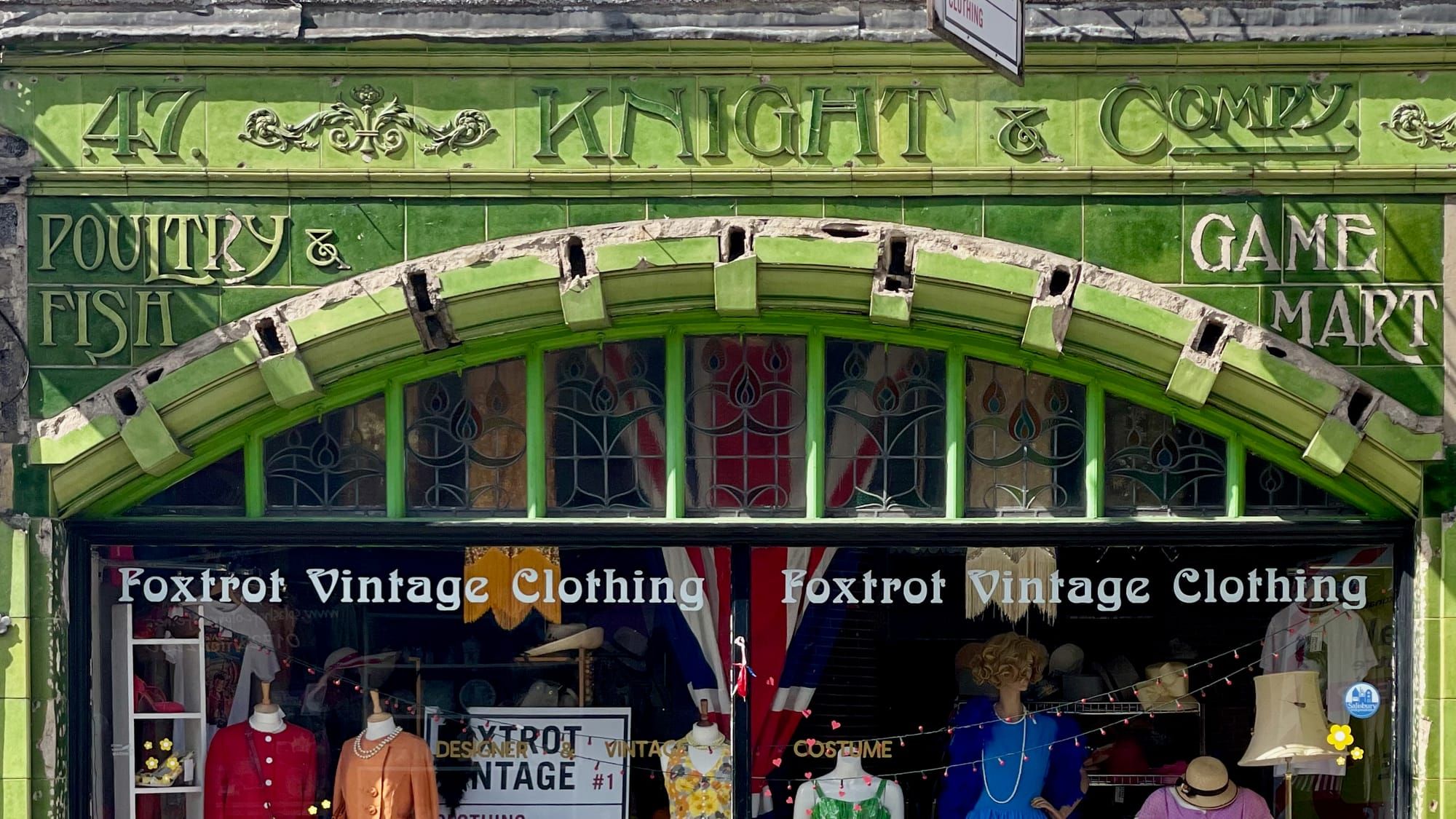
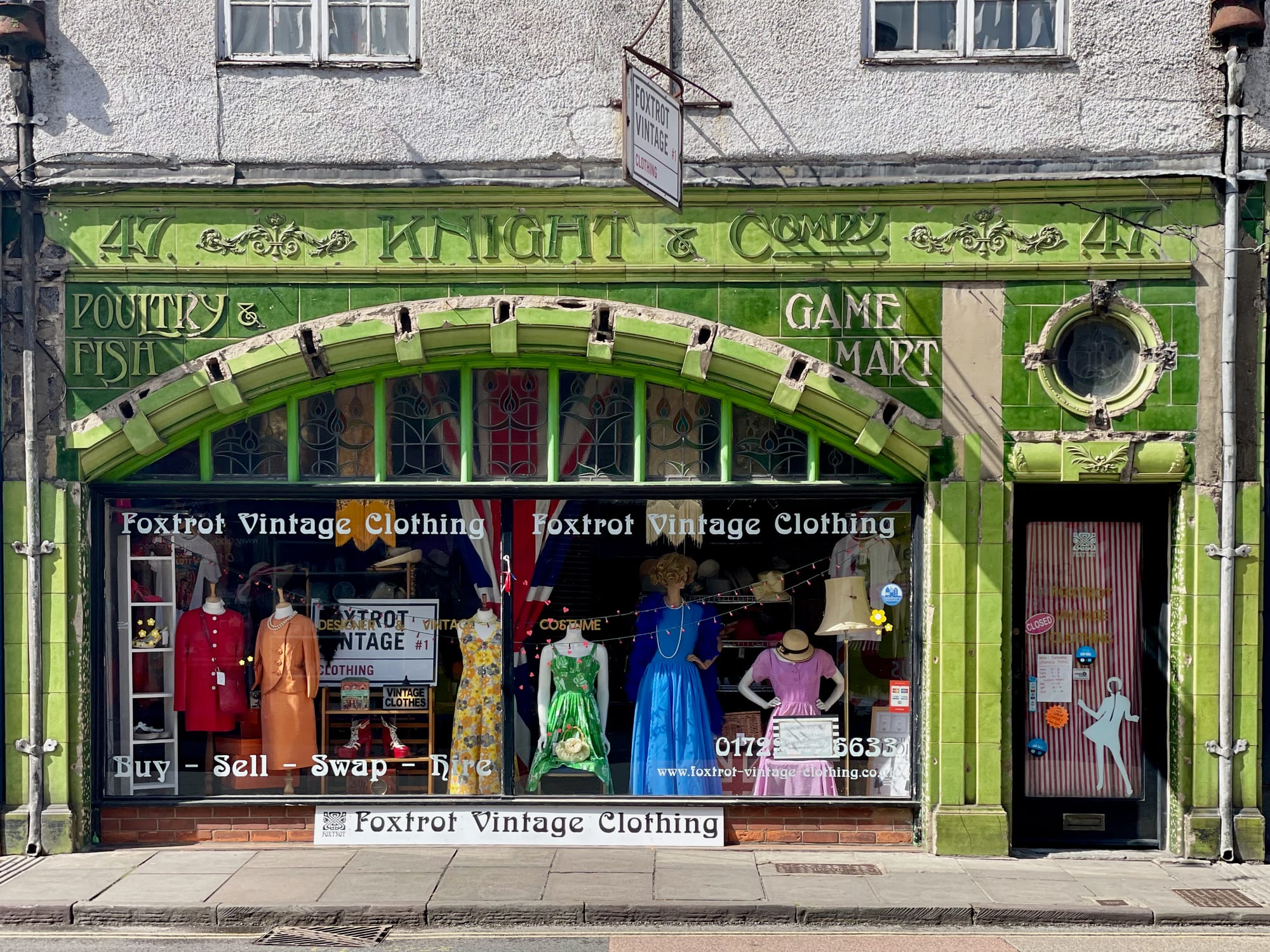
Believe it or not, the building below (Fishmarton Street) is one of my little indulgences. It's a rare survival in faience, but in a poor state of repair. It's at risk of loss. I love its utilitarian truth and the zeitgeist of the Art Nouveau typography. It's a time where the word 'Game Mart' had a different meaning.
I love the typography. Every letter has been drawn with personality: narrow, elongated strokes, unexpected curves and sharp little flourishes that make the words feel almost animated. Nothing is mechanically perfect, and that is precisely its joy.
The letters belong to the building, fitted around arches, tiles and windows like characters gathered for a performance. They advertise poultry, fish and game, but they also advertise confidence. This is lettering as architecture - individual, theatrical, joyful and utterly impossible to ignore.
Wouldn't it be wonderful to bring this back to life?
Connect with me on: Bluesky / Instagram / Facebook / X / Tumblr / Flickr / Vimeo / Pixelfed / Pinterest

Member discussion